Project 9: Portfolio

P9Samantha Sullivan by SamanthaS on Scribd

https://www.scribd.com/embeds/318471916/content?start_page=1&view_mode=slideshow&access_key=key-iR4vidxMhAbTCrzRSlSF&show_recommendations=false&show_upsell=false


Project Corrections / Time spent:

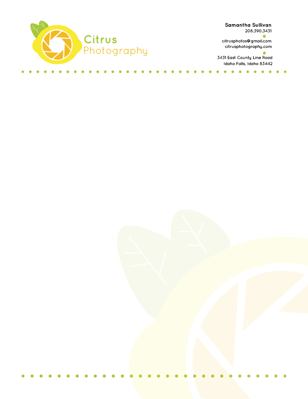
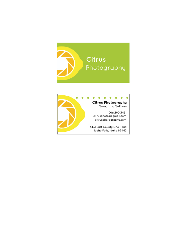
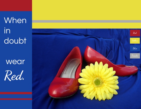
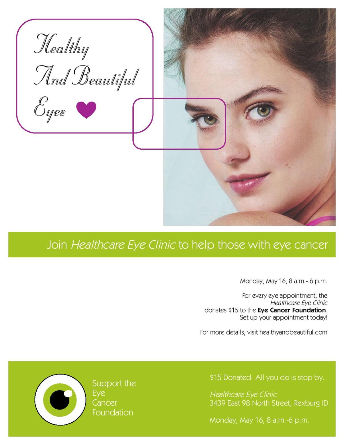
Photo-design got an hour and 10 minutes. Stationary got about 20 minutes. Web page got an 30 minutes. Event ad got 10 minutes. Logos got 5 minutes. In total, I spent about two hours and 15 minutes going back over my projects. On my photo design, I spent most of my time fixing the image of the shoes, extending the background so I could place it better. On my stationary, I played around with the text placement and I simplified some design aspects, like the circles that were on the letterhead. I moved the html and css over from Notepad++ to a site I like to use called Handcraft. It makes it a real website, and I knew how to validate from there. I cleaned up the Event Ad and changed some of the fonts on there.

Message:

I wanted to show my hard work from the past semester and showcase my personality.

Audience:

Future potential employers and/or clients

Top Thing Learned:

It’s okay to ask for help when working on something you don’t understand so it gets done right. When help isn’t physically available, YouTube usually is!

Future application of Visual Media:

I have valuable Adobe Photoshop, Adobe InDesign, and Adobe Illustrator skills that will be useful for everyday life, as well as professional. I also have a better understanding of color and what makes a design pleasing to the eye and mind.

Color scheme and color names:

Monochromatic: Teal

Title Font Name & Category:

Mogra- Decorative

Copy Font Name & Category:

Lora- Serif

Thumbnails of Images used:

None, the designs were handcrafted

Sources (Links to images on original websites / with title of site):

See above

Project 8: Brochure

Front

P8-SamanthaSullivan-FrontInside

P8-SamanthaSullivan-inside


Back

P8-SamanthaSullivan-back


Project 8 Blog Post

Description:

A duplex (two sided), original, folding brochure

Process (Programs, Tools, Skills):

Using the tools and programs I learned this semester, I created this brochure. In Adobe Illustrator, I put together a new logo for the company I created, Sweet Delights. The logo went through several drafts before it got to the point it is now. I tried to create a cupcake out of the S in Sweet so viewers would know what the company was about. I also used the fonts I would be using in my brochure to help tie it all together.

In Adobe Photoshop, I edited the quality images I found online. I cut out two cupcakes so I could text wrap them in Adobe InDesign. To do this, I used the quick selection tool in Photoshop and traced the cupcake. Then I used the ‘refine mask’ tool and used the smooth, feather, shift edge, and contrast bars to change the image. In InDesign, I placed the cupcakes where I wanted them, then I used the Text Wrap tool and selected the Alpha Channel option so it would wrap around the image itself, instead of the image box. I also lightened several of the images I used because they were too dark to fit the message and feel of the brochure. I tried to use pictures what were either more neutral in colors, or fit with my intended color scheme.

In Adobe InDesign, I decided I would create an Offset brochure, and measured out the lines I would have to use to create the effect I wanted. There would be a part of the inside sticking out to become part of the front when it was closed. I arranged the bars to unify the brochure, and kept using my color scheme colors.

Message:

The message is to promote this cupcake business I created, and get potential customers to see what Sweet Delights can do for them.

Audience:

The audience is those who are looking for a company who can accomplish a specific goal with cupcakes, whether it be catering for a wedding or making an exotic cupcake flavor.

Top Thing Learned:

I learned how to cut images out of their background in Photoshop, and how to text wrap them InDesign.

Color scheme and color names:

Split Complementary: Orange, Teal, and Red

Title Font Name & Category:

Cookie- Script

Copy Font Name & Category:

Comfortaa- Sans Serif

Word Count of copy:

261 Words

Thumbnails of Images used:

cutout 2 teal rose cc   cutoutpink and brown cupcakesblue and pink ccorange and teal ccoreo cc

Processed with VSCOcam with k3 preset

Sources (Links to images on original websites)

The Best Disney Cupcakes

https://sizzleanddrizzle.com/tag/orange-cupcakes/

https://www.pexels.com/search/cupcakes/

How to frosting a rose cupcake

http://kirbiecravings.com/2011/04/oreo-cupcakes.html

http://www.rescake.com/post_happy-birthday-pink-cupcakes-with-candles_174321/

http://abitchinkitchen.blogspot.com/2011/08/vanilla-cupcakes-for-two.html

Project 7 Web Page

P7SamanthaSullivanScreenshot

P7 Website Blog Post

Description:

A webpage I created to showcase my logo

Process (Programs, Tools, Skills):

I created this website using only Notepad++ and Photoshop. I had some previous experience with HTML/CSS, but I did some entirely new things with this page that I hadn’t done before.

After I put together my HTML and formatted it correctly, I connected a pre-made external CSS style sheet to the HTML page. I did, however, change a lot of things. I changed the colors, using the colors from my logo and using Photoshop to find the hex codes for the colors. I changed my fonts to Quicksand and Arvo, providing backup fonts in case those didn’t work. To use those fonts, I used Google Fonts to find the import code and used it in my CSS. I changed the opacity of the body copy and the background to the citrus image. I then added lots of padding and margins to create a nice, open design. Once I finished my page, I resized it in Photoshop to fit in .5″ margins.

Message:

My message is that my logo is a fun but professional logo with a lot of effort and thought behind it. The logo is intended to portray a fun, clean, and professional business.

Audience:

My audience is those interested in learning about my Citrus Photography Logo. The logo audience is those who want some photography done who want quality work while still being fun and different.

Top Thing Learned:

There were a ton of CSS things I learned how to do here, including giving the body some opacity, how to enhance readability by changing font weight, and to play with the padding and margins for space.

Color scheme and color hex(s):

Analogous, Brick, Yellow, Lime

My Lime is a6c83a, Yellow is f8ea31, Brick is f4b91f, brown is 231200

Title Font Families & Category:

Quicksand Bold, Quicksand Regular; Sans-Serif

Copy Font Families & Category:

Arvo; Serif

Changes made to the CSS:

Some changes I made were giving it more white space around the edges, decreasing the opacity of the body, and giving my h2 a background color, more margin, and the brick text color. I also gave my blog link some more top margin.

Word Count:

447 overall

Project 6 Stationary

Letterhead:

P6SamanthaSullivan

Business Card (8.5 x 11 layout):

P6SamanthaSullivan2

Business Card (Large Layout):

P6LargeCardLayout

Description:

My matching letterhead and business card designed with a personally created logo.

Process:

I created the logo in Adobe Illustrator. I combined shapes and used the pen tool to create the image of aperture on the lemon shape, and placed it next to my carefully chosen text. After I created the logo, I copied different versions of the same logo on other pages to be used in different places on the letterhead and business card.

Next, using Adobe InDesign, I created my letterhead. I implemented my color scheme into the design by using the colors in the dots and in the watermark, which was a slightly different version of my logo, but still recognizable as my logo. I played with the watermark opacity, and decided I liked it at about 5%. I placed my logo in the top left corner of the page, then moved my textboxes to the top right corner.  I spaced the text out so it would be read in related chunks, and bolded my name so it would be recognizable as the next important piece of information after the company name. I created a hierarchy by placing the most important information at the top, then moving down to the least important information.

On the business card, I created two rectangles, then colored the back of the card green. I placed part of my logo on that side, along with the company name. On the other side, I used the same green dots as on my business card to unify the two. I also used the same fonts to create repetition, and used the half logo from the other side of the business card. I spaced the info out to create hierarchy and placed the most important information at the top: the business name.

Programs/Tools Used:

Adobe Illustrator and Adobe Indesign

Message:

I wanted to create a fun and simple message, designed to appeal to those who wanted some fun in their photos.

Audience:

I was gearing this towards those who need pictures taken, who want something fun and creative. I was also working towards families with kids, hinting that I could take pictures and help the kids have fun with it.

Top Thing Learned:

I learned how to use the Pathfinder tool to merge shapes and to better use the pen tool.

Color scheme and color names:

Color Scheme: Analogous

Colors used: Gold, Yellow, and Lime

Title Font Name & Category:

Quicksand: Bold – Sans Serif

Copy Font Name & Category:

Quicksand: Regular- Sans Serif

Project 5 Logos

SamanthaSullivan-P5Logos

Description:

Descriptive logo for a company

Process (Programs, Tools, Skills):

Working in Adobe Illustrator, I created three different logo options. I did some marketing research and had people vote on which logo they liked better. The logo with the most votes was the one I chose to refine and turn in. I fixed the curve of the overall teardrop shape so it looked more cohesive. I also lightened the colors of the drop from my original draft to help with the watermark idea. I spaced the words out more so they would be easier to read from a distance. Then I grouped the image, and copy and pasted two different versions so I could change them to greyscale and white on a color background.

Message:

This company is a fun printing business who can take your printing needs and make them outstanding.

Audience:

People who need printing done for any sort of project, but more specifically people who need some more elegant printing done, or event printing.

Top Thing Learned:

I learned to work in Illustrator, which is the biggest thing. Inside that huge learning experience, however, I learned that some tools are more effective than others. Some will still get the job done, but others are easier to use or look better once finished.

Color Scheme and Color Names:

Analogous, Teal, Blue, Indigo

Title / Body Font Names & Categories:

Font: Sorts Mill Goudy

Category: Oldstyle

Project 4 Montage

SamanthaSullivan-P4Montage

Description:

An inspirational montage, created by blending two images together gradually and adding text.

Process (Programs, Tools, Skills, Steps taken while designing):

I used Adobe Photoshop to create my inspirational montage. First I sized my background canvas to be 11×8.5 inches, then I placed my background image. Then I played with the colors of the sky using the selective colors tool so they more reflected my chosen color scheme. Next I found an image of a book I liked and extended the background so it would blend better, and I could include more of the desk in the book image. I then placed my book in my image by using the lasso tool with a 100% feather and dragged it in. I resized it, then placed it where the person is in my image, so it would look like he’s coming out of the book. I then used a layer mask to blend the two images together and make it a true montage. I used several different opacity percentages to get my final image, with 100% on the hard edges, and going down the closer I got to my book. Then I looked on Google Fonts and found two fonts I liked, and played around with the sizing and alignment until I did something I liked best. I also added a subtle drop shadow to make my words more legible.

Message:

Books are amazing- they can help uplift us, carry us away to places we don’t know, and make us rethink what we know.

Audience:

I would hang this up in a library, so the audience would be those who like reading and are going to the library to pick out some new reading materials.

Top Thing Learned:

I learned how to make one image blend into another so it looked like they were one image. I also learned to add drop shadows to make things more apparent.

Filter / Colorization used and where it was applied:

Layer mask on the book, Selective Color filter on the sky, drop shadow on the text

Color scheme and color names:

Triadic color scheme of Orange, Purple, and Green

Title Font Name & Category: Tangerine, Script

Copy Font Name & Category: Lora Regular, Old Style

Thumbnails of Images used:

image5 space Open-Book

Sources (Links to images on original websites / with title of site):

  • Galaxy

https://unsplash.com/photos/oMpAz-DN-9I


  • Book

http://www.socialsciencespace.com/2012/02/post-phd-careers-plan-b-outside-of-traditional-academia/open-book/

Project 3: Photodesign

P3-SamanthaSullivan

Description:

Establish good photography skills and photo editing skills in Photoshop. Also incorporate a color scheme into an image and poster.

Process (Programs, Tools, Skills, FOCUS principles):

I first picked a color scheme from our Visual Media textbook, a triadic scheme. Then I found things to photograph that wouldn’t require a massive amount of editing to fix, only to enhance. I used my Olympus 100 camera to capture an image with good light, composition, and sharp focus. Then I went into Photoshop and edited the image using the techniques of levels, sharpness, vibrance, and color balance. Then I designed an 8.5×11 image using my triadic color scheme of red, blue, and yellow that included text, repeating color elements, and the color swatches I used. I learned how to extend my background using a tutorial online to make the blue background stretch out.

Message:

I wanted to make a fun image that has the elements of fun and creativity while still keeping a more mature air to it.

Audience:

My intended audience is people, more specifically women, age 20-30 about, who are just entering the professional field and still dress in more fun and outstanding colors, instead of the more professional attire.

Top Thing Learned:

I learned the importance of taking good photos straight from the camera, instead of trying to make it decent in Photoshop.

Color scheme and color names:

Triadic- Blue, Red, and Yellow

Title Font Name & Category:

Questrial- Sans Serif

Copy Font Name & Category:

Dancing Script- Script

Date and location you took the photo(s):

May 18, 2016 at Snowview Apartments

Thumbnail of original, unedited image inserted:

OLYMPUS DIGITAL CAMERA

P3 Activity: Photography

OLYMPUS DIGITAL CAMERA
Light 1: Outside
OLYMPUS DIGITAL CAMERA
Light 1: Outside
OLYMPUS DIGITAL CAMERA
Light 1: Outside
OLYMPUS DIGITAL CAMERA
Light 1: Outside
OLYMPUS DIGITAL CAMERA
Light 1: Outside
P3SamanthaSullivan-lead-room
Light 1: Outside

I had a lot of fun learning how to control the camera to take some fun images! I metered the camera to take good pictures of the sky, then enhanced them in Photoshop. I took pictures of a willing friend inside, using natural light, and used layers to clean up some details. For the foreground and background pictures, I went to the BYU-I gardens and took pictures of some lovely spring blossoms and a statue. The distance between the foreground and the background helped the image come out the way it did. If the flowers hadn’t been so far away, it wouldn’t have turned out quite as nice.

For the tulips,  I made sure they were on the third lines, and put as much of them as I could on those lines. Finally, I snapped a picture of a bicycle, and had it leading into the image to get the lead room I wanted. This one was harder for me to get the concept of, since it seemed to blend in with the thirds rule so much. Eventually I got an image that I thought fit the assignment.

Project 2 Event Ad

P2SamanthaSullivan

Description:

A color full-bleed event ad designed to promote a fundraiser using only a scanner and Microsoft Word 2011.

Process: Programs, tools, skills, FOCUS principles:

I scanned the image in using a Cannon scanner and then sketched my ideas out. Once I settled on a sketch idea, I created it on Microsoft Word 2011. I tried to use color and fonts to work with my audience and to enhance my message. I aligned as many elements as I could and used rectangles to create unity. I was surprised at the things I could do in Microsoft Word, and could use it if needed later.

Message:

I am advocating a fundraiser where people can come have their eyes checked, and when they do the company will donate money for eye cancer research.

Audience

The audience would be adults who are out in town and looking at event boards for things to do. The intended effect is for the bright colors to catch their eyes and they will realize they can do good while getting something necessary done anyway.

Color Scheme and color names:

Complementary, Lime and Violet

Top thing learned:

I learned that simplifying is sometimes hard, but the clean and non-distracting effect is worth the hassle. It makes it easier to read, and it’s less cluttered.

Title Font Name and Category:

Stuyvesant BT, Script

Copy Font Name and Category:

Bk ITCKabel Book

Scanned images used, sources, original sized, location of scanner used:

The model image came from Mary Kay Applause June 2016 magazine. The original size was 9.5” x 6”. I used the Cannon scanner in my apartment, making sure the image quality had 150 ppi.

eyes 1